![]() A lot of people ask me about our brand design and the graphics that accompany these blog posts.
A lot of people ask me about our brand design and the graphics that accompany these blog posts.
They see the same visual cues on the BN Branding website, in social media posts, in presentations, in our ads, emails, videos and even on good old-fashioned post cards.
![]()
They comment about our graphics when they see ’em on LinkedIn and, some people have even said, “Wow, that’s really cool. Can you do something like that for my company?”
Of course. We’re happy to create branded graphics that are uniquely yours, and consistent across all marketing outlets. Because the fact is, bold graphics such as these stop people in their tracks. It’s brand design that produces response.
![]() It’s like direct response branding.
It’s like direct response branding.
As prospects are scrolling quickly through a social media feed they breeze right over all the stuff that looks the same as everything else… Cheesy stock photos, boring charts and graphs, corporate head shots, stock Canva designs with colorful gradients, even stupid cat videos get ignored these days.
People only pause when they see something that “Pops.”
Which means it’s visually distinctive or different. The incongruity of the image or message, relative to everything else they see, creates natural human curiosity. It’s just the way our brains work.
On the other hand, we are wired to ignore the images, sounds and words that are familiar to us.
So familiar words, sounds and imagery do not belong in your advertising efforts or in your library of branded graphics.
Thanks to an increasingly fragmented marketing landscape, the need for consistently UNfamiliar visuals is on the rise. There are just so many different marketing tactics these days, it’s hard to get them all aligned into one, cohesive campaign.
There’s a lot of stuff to get produced, so most companies lose that “Pop” they could get by maintaining visual consistency across various platforms.
Chat GPT and other ai tools are compounding the problem. They are literally programmed to search for what’s already out there, so your odds of getting anything new and different are astronomical.
The same goes for branded sounds. The very best radio, TV and video campaigns include unique sound cues that tie all the components of the campaign together. There are firms that do nothing but sonic branding for the world’s largest brands. Because sounds stick! Echoic memory is dramatically more accurate than visual memory.
Once when I was working on an award-winning radio campaign for a glass company, the spots were all done, but they felt flat at the end. They lacked the auio “pop” they needed, so we created one. The audio signature couldn’t have been more clear… the squeek of windex on a window. It was a memorable, audible punctuation mark that proved very successful.
[convertkit form=5936283]
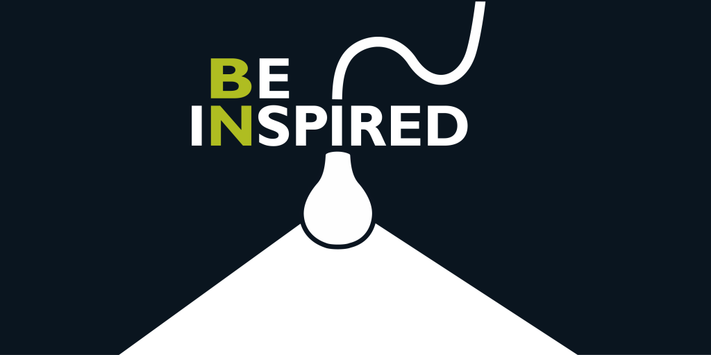
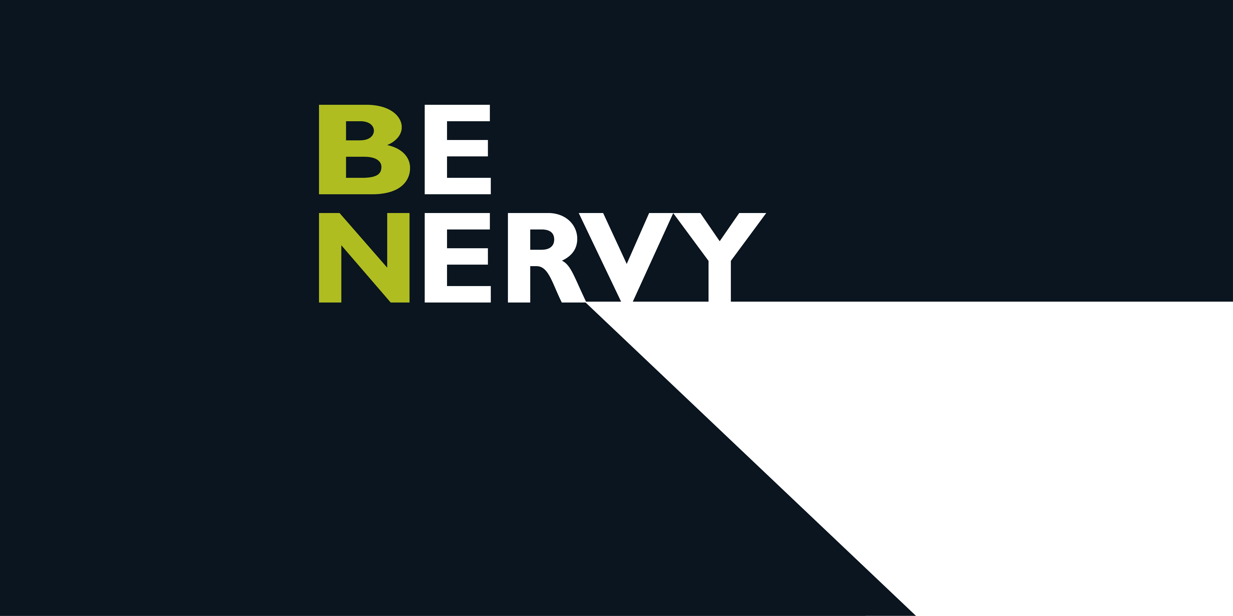
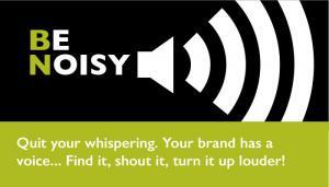
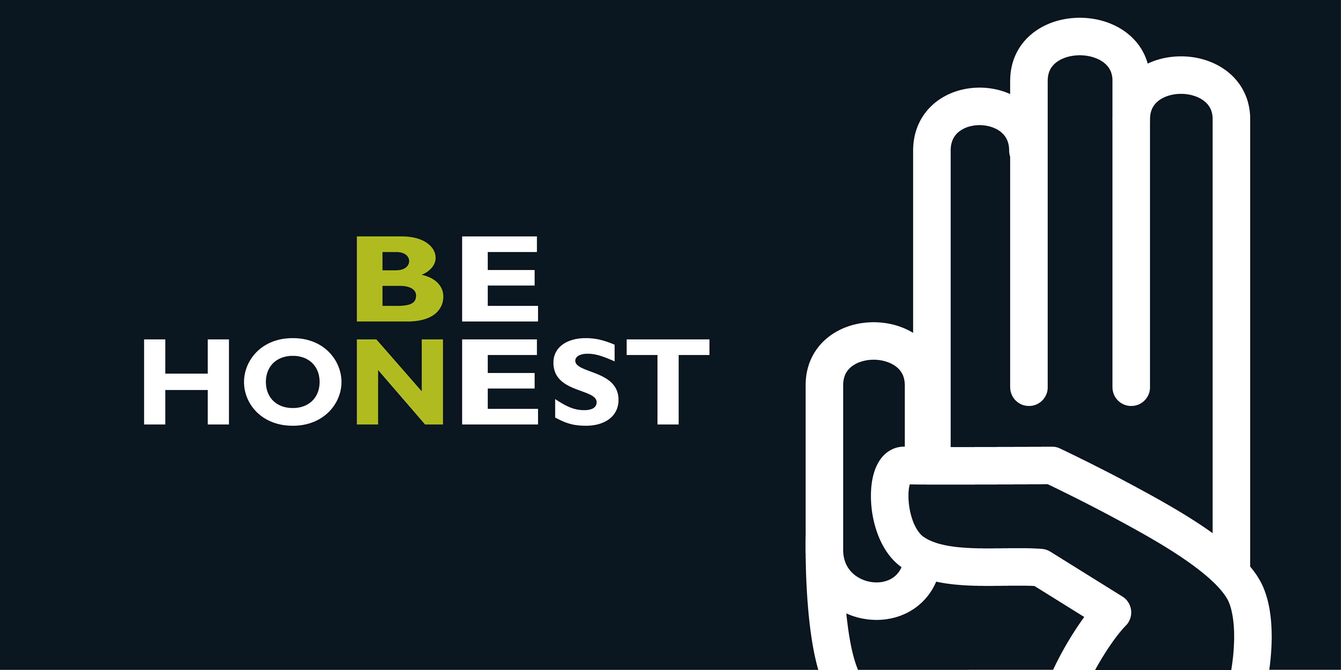
Visual punctuation marks, such as the images in our “Be” Campaign, can make small budgets look big. It’s one of the little things that small businesses can do to become iconic brands in their own, little spaces.
Tom Peters, in his book The Little Big Things, says “design mindfulness, even design excellence, should be part of every company’s core values. Because the look IS the message. Because design is everything.”
Some people seem to think that “branding messages” do not belong on social media or in digital advertising. And that you can’t design a “branding” website that also moves product.
That’s hogwash.
As Peters said, every message out there is branding. You can’t say that sales messages or social media messages or packaging messages are not brand messages. It’s all connected. You might as well make them look that way.
Consistent, unexpected brand design is the easiest way to improve the impact of your messages and leverage your marketing spend.
If you’re not thinking about branding and design aesthetics when posting something on LinkedIn or Instagram, you’re missing a huge opportunity. People will just scroll on by.
If you’re not thinking about design when crafting headlines for your website, you’re not seeing the big picture. People will just click right out.
If you’re not thinking about your brand image when choosing a location or decorating your office space, you’re missing the boat.
Design is just one element of your overall branding efforts. But it’s an important one. Too important to ignore. Because every time you hammer home those visual cues, you move one little step closer to your objective.
Visual credibility is highly underrated. You cannot ignore the importance of that intangible first impression. When no one stops to read, the look literally IS the message. It’s either credible at a glance, or not.
It’s much faster, cheaper and easier to achieve visual credibility than thought leadership or category credibility. Those can take years.
So it’s particularly important for start-ups to look good and have a polished brand image, right from the get-go.
If your business needs a stronger visual presence across all marketing channels, give us a call.
Or click here for an inexpensive yin/yang assessment of all your marketing efforts.
![]()
Same with sounds.