![]()
I’ve been a fan of Starbucks since they opened their first store in Portland, in 1987. I don’t think there’s been a brand, since McDonalds, that has had a bigger effect on our society than Starbucks. It truly is, one of the most iconic brands in the world, and has grown to be one of the most valuable.
Interbrand ranks Starbucks as the 56th most valuable brand in the world. It’s market cap of 120 billion dollars.
Notice anything different at your local Starbucks lately? I sure have. The familiar green and white logo on the cups is missing. It’s a travesty to brand-conscious graphic designers everywhere.
At first glance I thought maybe it was just a corporate cost-cutting measure — the result of tremendous Wall Street pressure to improve performance. But once I looked a little closer, I noticed something even more revealing:
Starbuck has bared her breasts! The mermaid that’s been the Starbucks icon from day one, has gone back to her topless, hippy roots.
There are a lot of other changes going on at Starbucks in Seattle — you might even call it a corporate shake-up — but none are as symbolic as the undressing of the logo.
A great article in Fast Company magazine reveals some of the latest nuances added to the siren logo.
 I take it as a sure sign that CEO Howard Schultz is serious about stripping away some of the fat and refocusing on the core of the Starbucks brand .
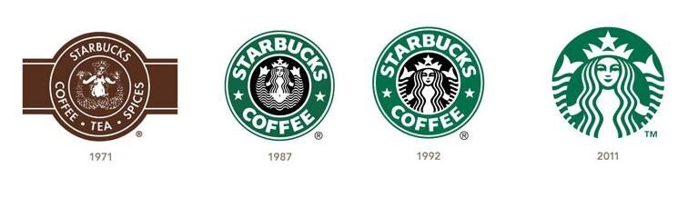
That little nod to the humble heritage of his company says a lot. The green logo has just two words: “Starbucks Coffee.” The retro logo reads “Starbucks Fresh Roasted Coffee.” It’s a reminder to the world that Starbucks has always been obsessively focused on the quality of it’s product.
![]() In his book, Pour Your Heart Into It, Schultz says, “The number one factor in creating a great, enduring brand is having an appealing product. There’s no substitute.”
In his book, Pour Your Heart Into It, Schultz says, “The number one factor in creating a great, enduring brand is having an appealing product. There’s no substitute.”
I know a few coffee snobs who claim that Starbucks isn’t as good as the local guy’s Ethiopian Tega & Tula. And they may be right. But I also know that Starbucks beats the hell out of the mom & pop drive-up operations that have appeared on every corner.
At Starbucks, the product is consistent. The coffee is just as good as ever, but the company has made some operational decisions that have had a subtle effect on our perception of that quality. Shultz seems determined to correct that, and if his track record over the years is any indication, he’ll pull it off.
Ever since I read his book back in ‘99 I’ve used Schultz and his organization as a great example of focused leadership, exceptional execution and textbook branding. He has always been the brand champion in that organization. He was one who introduced the idea of gourmet coffee to a nation of Folgers drinkers, and he has always fought to maintain quality standards even during their hyper-rapid growth.
Shultz is adamant about controlling the brand experience as much as possible, down to the last detail. That’s why the company never sold franchises. At first, Shultz didn’t even want to sell coffee in paper cups at all, lest it detract from the experience and affect the flavor.
So these new “transformational initiatives” of his are no big surprise.
First thing is to recapture that appealing coffee aroma in every store. Believe it or not, that smell of fresh roasted coffee is every bit as important to the brand as the look of the stores or the music they play. It works on a subtle, subconscious level, but the bottom line is, you won’t hang out and enjoy your double half-caf mocha if the place doesn’t smell good. So Starbucks is going back to manual espresso machines and killing the sale of breakfast sandwiches.
The Starbucks business model is based on the idea of the third place… that we all need a relaxing getaway that’s not home and not work. To me, it’s more of a romantic, Vienna coffeehouse experience than a quick, Italian espresso shot. So the roll-out of free wi-fi service is long overdue. Paying for an internet connection at Starbucks was just idiotic to me.
The third and final cornerstone of the Starbucks brand is its own people.
“We built the Starbucks brand first with our people, not with consumers — the opposite approach from that of the cereal companies,” Shultz said. “Our competitive advantage over the big coffee brands turned out to be our people.”
Starbucks doesn’t just talk about treating people well, the company really does. In the retail food service industry, where getting good help is always a challenge, Starbucks leads the way with its pay scale, benefits packages, training programs and retention rates.
“We believed the best way to meet and exceed the expectations of customers was to hire and train great people. That’s the secret of the power of the Starbucks brand: the personal attachment our partners feel and the connection they make with our customers.”
The company also listens to its front-line employees. The idea for Frappuccino came from the store level. The new website, mystarbucksidea.com, started out as an internal feedback tool for employees. Now anyone can go online and post their own ideas for Starbucks, vote for the best, and see what’s being implemented.
Which brings us back to that idea of reintroducing the old logo, circa 1971.
The change coincides with the introduction of a new house blend, called Pike Street Roast, for people who just want a good, robust cup-o-joe. In that context, and with everything else that’s happening at Starbucks, the branding throwback makes perfect sense.
The mark was originally inspired by a woodcut image of a Norwegian mermaid, fully exposed. Over the years, as Starbucks grew and became “more corporate,” the logo slowly morphed. Eventually the designers gave her long hair, which covered her breasts and made her more palatable to a broad commercial audience.
![]()
Now Shultz wants to go back in time. Back to when the company wasn’t really worried about offending anyone on Wall Street. Maybe this little flash of skin is just what the company needs.
Updated again in 2011
![]() If you want to recapture the magic of your brand, or build a new one from the ground up, give me a call. 541-815-0075
If you want to recapture the magic of your brand, or build a new one from the ground up, give me a call. 541-815-0075
As the logo evolved, it got too perfect. It lost some of the mystery of the older versions. Lippencott article in Fast Company