![]() There was a group discussion on LinkedIn recently that started with this question: “Does website design really matter? ”
There was a group discussion on LinkedIn recently that started with this question: “Does website design really matter? ”
It provoked quite a debate… Graphic designers and advertising people in one camp, web programmers and entrepreneurs in the other, arguing their respective positions.
The paint-by-numbers group believes web design doesn’t really matter at all.
Design aesthetics, they say, should always take a back seat to functionality, speed, SEO rankings, traffic-building strategies and ease of use.
Besides, why spend money on design when there are so many free design templates and WordPress themes to choose from?
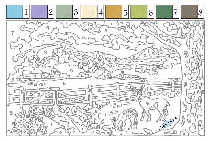 Just fill in the blanks and you’re good to go. A lot of programmers who don’t have an artistic bone in their bodies fit into this category.
They can build functional websites with lots of technical bells and whistles, but there’s something definitely missing. They feel forced. Unnatural.
The other group likes to color outside the lines. They believe website design really matters.

This side argues that you absolutely have to make a great first impression, so you should make sure the site is well-polished, on-brand, and visually differentiated before you spend a dime driving traffic to it.
Every website design is a blank canvas, with masterpiece potential.
As a traditionally trained advertising guy, I side more with this crowd.
We’re trained to break the rules. Attention-getting ideas and exceptional execution are absolute requirements, so we loathe templates. We’re also taught to polish every last detail before we deliver the work to a client.
This mentality of pride and craftsmanship was beaten into me from my earliest days in high school graphic arts class, and it applies directly to web design for several reasons:
- Because people are drawn to ideas presented in unexpected ways. Way more than they’re drawn to companies or products.
- Because details affect conversion rates. It’s been proven time and time again. Crappy looking ecommerce sites don’t perform as well as nice looking ones. Shopify has boatloads of data on that.
- Because differentiation matters. And if you just paint by numbers, your site will look like every other site.

But I also understand the other side of the argument…
In the entrepreneurial world, as in software development, “lean” and “iterate” are the buzzwords. Their mentality is, “just get something up! We’ll add to it and fix it later.”
That’s a tough one for writers and graphic artists who always want to do great work. But as a CEO friend once said, “it’s not great work if it’s not done.”
We need a high-bred approach to web design that combines the craftsmanship of old-school advertising with the rapid “lean development” that entrepreneurs favor.
We need to get web designs done quickly, AND really well. Quick and polished, not quick and dirty. Because first impressions will always matter.
If you just fill in the blanks of another WordPress theme and insert your Instagram feed, your site’s going to fall flat on many different levels.
If you choose to cut corners and get it up quickly with cookie cutter design templates, you better be ready to circle back around quite soon to do the fine tuning.
One comment in that LinkedIn discussion was, “I cannot think of a time when website design affected my decision to keep looking at a site.”
Yeah, right. That’s crazy talk from someone who thinks everyone goes through life making decisions in an orderly, logical fashion. Like Spock.

I guarantee you, that person is affected by design EVERY time. He just doesn’t know it, and would never admit it.
Of course he “can’t think of a time,” because great web design works on a subconscious level that computer programmers don’t understand, nor acknowledge.
It’s an instantaneous, subconscious judgment that leads to spontaneous click of the mouse. There’s absolutely nothing logical about.
Before you know you’ve made a decision, you just stay and linger. Or you click on something. Or leave. You don’t know why. You just do.
The latest brain research shows that humans can initiate a response to stimuli before the neocortex can even interpret the stimuli. In other words, we act before we think.
So the first impression is critically important, and that hinges on design and spot-on messaging.
Poor website design leads to confusion, and nothing drives people away faster than confusion. If the immediate, split-second impression is a little off, they’re outta there. Plenty of beautiful websites don’t convert worth a hoot because of confusion.

On the other hand, good design leads to clarity, and understanding at a glance, which is the litmus test for sticky websites.
Instantaneous recognition of relevance.
I think part of the problem with this discussion is a limited definition of “website design.”
When it comes to websites, design is not just the aesthetic elements, as in traditional graphic design, but also the site planning, messaging, and user experience.
It’s a holistic approach to web development that I like to call Conversion Branding. It’s a well-coordinated team effort between a copywriter who knows persuasion architecture, a talented graphic designer, a technically proficient programmer, and a trusting, intelligent client.
Remove any of those people from the equation and the website simply will not come together as you had hoped.
But back to that discussion… Much of the thread was about the importance of “web marketing” vs. “website design.” In that case, balance is the key.
You don’t want to spend money to drive a lot of traffic to a website that isn’t enticingly relevant and user-friendly.
There’s an old saying in the advertising business: “nothing kills a lousy product faster than great advertising.”
If your website is lousy, driving traffic to it will just speed your demise.
On the other hand, you don’t want to spend too much on design only to be left with no money for SEO efforts and digital advertising that’ll push traffic to the site.
I agree that having something up and online is better than nothing at all. But be careful… people are pretty unforgiving.
If you’re not an iconic brand, one lousy experience and it’s bye-bye. They won’t return for your website 2.0.
There are a few other things you need in order to get a good website up fast:
- A well-crafted brand strategy which provides context and perspective.
- A detailed website plan that spells out specific objectives, target audiences, paths to conversion and other critical elements of your site.
- Exceptionally creative, yet clear, messaging. You gotta get the words right!
If you leave your web site production to the computer nerds, you won’t get the brand strategy, the site plan, the messaging or great design.
Programmers simply follow directions and program the site as it’s presented to them, in the fewest keystrokes possible. That’s why templates are so popular.
And guess what… graphic designers aren’t very good at that strategy and messaging stuff either.
I’ve seen designers obsess over the tiniest minutia and then miss the fact that the main headline of the home page is completely unrelated to the business at hand.
It’s a very pretty mess.
So we’re back to that idea of balance and a four-person team. Yes, website design absolutely does matter. But so does Functionality. Messaging. Conversion. Authenticity. SEO. Photography. And copywriting — don’t forget that.
For some reason, most business owners seem to think they can write web copy, even though they’d never dream of writing their own print ads or TV spots.
Suffice it to say, most business owners don’t have the training or the craftsmanship needed to produce a good website. Unfortunately, neither do programmers. Neither do designers. You need the whole team.
Together you might just find a great website design that also produces spectacular results.
If you’re thinking of upgrading your web presence, contact me here. We’ll be happy to talk you through it and design you a website that’s just the right balance of art and commerce.
![]()


I have come to the conclusion that any programmer or internet marketer that does not understand the importance of design is more likely than not, an amateur. Those that think design has little importance has never full understood their Google Analytics Reports, performed A/b testing, or generated a large volume of sales online.
The very first action that is taken by a website visitor is with their eyes. If they dont like it, they wont stick around to read it. Its really that simple. You dont need a 10k design budget, but your business is worth more than a $500 freelance student.
I need to agree with Alex here. Design and “user experience” go hand in hand. And anyone not seeing that is a newbie (or just closed up in a box!!)
A website needs to be designed in such a way that it captures a users eye, but it also needs to load fast, else the user will bounce.
Also, if you land on a site that has no hierarchy, is full of flamboyant colors and you have no idea where to look first – it makes stuff difficult to find etc – are you REALLY going to stay on that site and try figure out for 15 minutes where to do XYZ?? I doubt it!
That’s where design and user experience meet 🙂
John, very interesting article and the very same “discussion” I had when trying to get my own site up and running. Being a brand guy, I tend to lean toward the side of the creatives – if you “just get something out there,” people are going to view – and evaluate – based on what’s there…not based on what’s left in your mind that you intend to add or fix.
Being completely overstimulated, they’ll take those couple of seconds and decide to stay or go. Obviously design and layout is one of the most critical elements that impact those first few seconds.
I suppose it ultimately comes down to the question “how close are you to 100%?” If 80, that’s probably good enough because it will never actually be 100 if you are honest with yourself. But if it’s 60 or 70? That may be just short enough that you lose your one shot to stick.
Hi, Thank you for selecting this topic. its very interesting article .
Hello and thank you for selecting this subject for debate. In my opinion, I think the web site design is very important but it must connect to a content also important. The two go train. The first impression that a site is its design and also the last impression is its design. If the design is beautiful, it will easily become familiar with the site and memorise them to return after.
Greetings I am so excited I found your webpage, I really found you by error, while I was researching on Bing for something else, Anyhow I am here now and
would just like to say kudos for a incredible post and a all round
thrilling blog (I also love the theme/design), I don’t have time
to read it all at the moment but I have book-marked it and also added in your RSS feeds, so when I have
time I will be back to read a great deal more, Please do keep up the awesome b.
Thanks again for the article.Thanks Again. Really Cool.
Get top-notch digital marketing training in Delhi with expert-led courses covering SEO, PPC, social media, and more. Boost your skills and career today!
https://dizitaladda.com