![]()
Never underestimate the power of brand identity design. For good or bad. Decades after you’ve completed that important but undervalued project your brand identity will either be a tremendous asset to your business or an anchor that continually drags you down.
It’s not just about looking good — it’s about selling more, building goodwill, and gaining long-term brand loyalty. If your logo looks like crap on a hat it’s going to be a continual drag that rubs off on other parts of the operation.
I see that a lot in the golf business.
Many golf courses make good revenues off their branded merchandise. If you’re Pebble Beach, Augusta National, or Bandon Dunes, it doesn’t matter what your logo looks like. You’re going to sell a lot of branded hats, shirts and golf towels simply for the souvenir value.
But if you’re one of 120 courses in Palm Springs or Mrytle Beach fighting for every last penny of revenues, you better have a brand identity design that looks nice, differentiates you from the pack and moves product off the shelves.
That’s where Design, with a Capital D, can provide a tremendous competitive advantage.
Or not. When the brand identity of a golf course is not up to the standards of the golf course itself, the owners leave a lot of money on the table.
The objective of branded merchandise is not just to make a buck. It’s also about marketing…
When your customers go elsewhere to play golf you want them wearing YOUR merchandise. So brand identity design, when done well, turns customers into walking billboards.
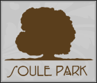
Unfortunately, a big brown blob for a logo is not what anyone wants to wear around. Doesn’t matter what fancy brand of shirt you put it on, it still looks like a little dollup of dog doo. No one wants that on their hat, or even on a golf ball.
The lingering effect of an ugly logo and a lousy name is ugly sales figures in the pro shop.
Every golf course has trees, so a tree logo is not going to differentiate your course. Not one bit. And yet trees are a dime a dozen in golf course logos. It’s the second most over-used visual cliche in the golf industry. (Second only to two golf clubs crossed)
Here are some more examples of bad brand identity work for golf courses. Bad brand names and bad brand design…
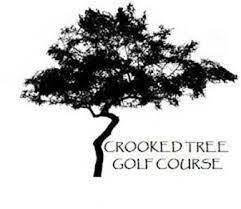
There’s Crooked Tree, Crooked Stick, Crooked River, Crooked Canyon… I’d love to see one called Crooked Shot! Now that would be relevant and appealing to a lot of people. “Hey, now that’s a course for me!”

Have you ever seen a pine tree that looks like a human brain? I don’t think so. But I’m getting too literal.
Yes, there are a lot of pine trees in this country, many of which are found on golf courses. That’s no reason to name your course after them.
There are more Pine somethings than any other name in golf… Pine Meadows, Pine Needles, Pine Forest, Pine Lakes, Pine Ridge, Pine Dunes, Pine Apple and the king of them all… Pine Valley. The #1 course in the world year after year.
And this one, which makes no sense whatsoever… Pine Oaks. Are there pines and oaks, or is it some kind of hybrid tree that I’m not aware of?
Is this logo for Oak National? Oak Tree National? Oak Branch National? I’m not sure. Is it any better if it’s called “National Golf Club?”

It’s difficult to execute the idea of a tree in a simple, pleasing graphic style. And the more literal you get with your logo, the worse it is. Juniper trees are unwanted, unliked and unattractive. Why put one on your logo?
This moss-covered oak tree appears to be bleeding. Or is it a Rorschach ink blot test? I’m not sure. Every year that this logo remains on the shelves means the course is leaving money on the table.
Bottom line:
This is what happens when real estate developers come up with names themselves. Everything starts sounding like a funeral home. (If you’re trying to name something, read this book first!)
Unless you’re Cypress Point or Pine Valley, don’t use a tree as your logo. Just don’t do it!
If your golf course has a painfully generic name like Pine Anything your identity design has to work even harder! You’ll always be trying to compensate for the meaningless words.
If you buy a logo from Fiver you’ll only get the most literal, no-brainer ideas. (Like that oak tree above.) Low cost, foreign designers will not spend time getting to know your market or your brand, much less your industry and your operational advantages.
They won’t understand how the logo has to appear on a logo or a ball marker. They won’t appreciate the nuances of your golf course, or the game, for that matter. So that cheap, unappealing logo’s actually going to cost you money every year in the form of lost sales.
It’s like negative ROI of 10x… If you spend only $300 for a logo, it’s going to cost you $3000 in lost sales year after year.
But don’t quote me on that. Long term, the linger effects could be much worse. (Read about one worst-case scenario.)
Your brand identity design goes beyond the logo. It’s words too. Ideas. And a story.

A long time ago when I first moved to Bend, Oregon I was tasked to do some advertising for a local golf course with the unfortunate name, “Pine Meadows.”
I said no way.
“We’re not spending a dime of their money on advertising until we convince them to change the name,” I insisted.
“It sounds like a cemetery or a trailer park. Besides, there are a 27 golf courses across the country called Pine Meadows. There’s no way they could trademark that.”
Thankfully, the new owners were open-minded. Even though they didn’t fully grasp how bad Pine Meadows really was, they approved an additional budget for naming. (We have a great process for that)
So we dug in. We researched the history, geography and geology of the area. The course overlooks the Deschutes river, so that was a source of inspiration. We looked into the local flora and fauna, and even tribal legends from the earliest inhabitants.
The name I came up with is, to this day, one of the most memorable golf course brand names in the country: Widgi Creek. Three syllables. Starts with a whisper and ends in a hard K sound.
No, there’s no creek by that name.
However there were some petroglyphs not far from the site. And there always are plenty of elk meandering through the golf course. Thus, the brand identity design by Shelly Walters.
This name and identity has a great story built into it. Everyone wants to know where it came from and what it means. In other words, it’s engaging!
No one ever asked, “what’s the story with Pine Meadows?” Snoozer names = snoozer sales.
Once the name and identity were complete we did print, radio and television advertising that propelled the course to #1 in the market.
Widgi Creek is not the best golf course in Central Oregon… The layout is a bit tricky and the green complexes are no fun, but it books more rounds than any other course in town.
Golfers are quick to forget how poorly they putted or how many trees they hit, but no one forgets the name Widgi Creek.
When tourists come to town and ask their buddies “where should we play?” the first thing outta their mouths is “Widgi.” Top-of-mind awareness and name recognition is what drives Google searches and tee time bookings.
Obviously, it takes a lot to keep a golf course running profitably year after year. Merchandise sales are just a tiny part of the picture. And you can’t put lipstick on a pig, so if the condition of the course is horrendous beautifully designed merch is going to get people back for a second time.
However, an engaging brand identity makes everything a little bit easier. Here’s what you can expect from the lingering effect of well-conceived, well-executed brand identity design in the golf industry:
• Higher margins and faster turns on all branded merchandise the proshop.
• Tee sheets booked solid, even in the shoulder seasons. A healthy mix of tourist rounds and local’s rounds.
• Higher-end clientele, which translates to more revenue per round.
• Higher percieved value of every round played.
• Better Google reviews, more website traffic and local word-of-mouth.
• A healthy mix of young and old, women and men. Millennials are more design savvy than 70-year-olds.
• Better top-of-mind brand awareness even in crowded golf markets. Almost every year Widgi Creek gets voted “Best Golf Course” by a local paper.
If your branded merchandise has been moving slower and slower, give us a call. It’s probably a design problem.
If your brand identity dates back to the Ben Hogan era, it’s probably time to think about a rebranding project. You’ll never know how much you’ve been losing until you get your brand identity aligned with the modern golf market.
Times are changing. There’s music and hoodies and mobile apps all over the golf course. Do you want to look like your grandpa’s niblick? Or do you want to look this good.
Get help with your naming and your brand identity design. Contact me here, or reach out on Linked In.


