Food Packaging 101 – Lessons From a Billion-Dollar Tortilla Brand
![]() Here’s a case study I’d like to share in food packaging design. I was not involved in this rebranding, but my hat’s off to the design team and to the Garza family for embracing the change.
Here’s a case study I’d like to share in food packaging design. I was not involved in this rebranding, but my hat’s off to the design team and to the Garza family for embracing the change.
It’s noteworthy due to their rapid rise from start-up to acquisition. Proves what I’ve always said: “There’s good money in tortillas and beans.”
Veronica Garza started making grain-free tortillas for herself back in 2013. It was out of necessity… she couldn’t eat traditional flour tortillas, or anything with grains.
When Veronica’s grandmother said that her new tortillas tasted better than the handmade tortillas she grew up with, she knew she was on to something. So the entire family pitched in to start a company.
They had a tasty product in a rapidly growing category, but as you can see, they missed the mark with their original branding…
|
|
Here’s a whole bunch of reasons why they wisely decided to re-brand the company…
• The Wrong Brand Name
Must B Nutty is a terrible name for a tortilla company. It misses the category code completely — sounds more like a nut butter company than a tortilla company.
Not only that, it sounds whimisical. Whimsy is seldom a good match for a food company that wants to build a seriously successful brand.
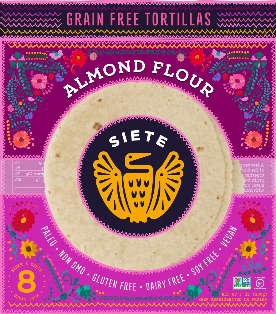
They renamed the company Siete, which means 7 in Spanish. There are seven people in the Garza family, plus they decided to lean into their Mexican heritage.
Their new name fits all the criteria for a Money Name that I outline in my new book.
|
|
• The Wrong Wording on the Package
This is a point I often make when I’m talking to food company owners…
Stop wasting room on your packaging with stuff that’s totally obvious. That space is precious!
In this case, it’s obvious that these are tortillas. Any two-year-old could tell you that. And yet the biggest visual element on their original package was the word TORTILLAS, in big capital letters.
Clients always want a giant description of the product and a long list of features on the front of their packaging. As if shoppers are complete idiots.
Remember, the #1 job of any package design is to catch the eye and attract attention. Educating people is not the first job to be done.
So you have to prioritize what you’re going to say and make good strategic use of all panels of a package.
Jason Feifer, the Editor of Entrepreneur Magazine put it this way: “Before (the rebrand) the PRODUCT told the story. After, THE BRAND told the story.”
The new brand is vibrant, exciting, and eye catching. The old one, not so much.
|
|
• Unreadable Logo and Uninspiring Food Package Design
There was nothing tasty looking or attractive about their first package. White type on a light blue background makes a logo that’s totally illegible. It almost looks like a generic store brand.
Usually that’s bad, but in this case it worked in Garza’s favor. By de-emphasizing the brand and focusing only on a description, they sorta side-stepped the confusion caused by the “Must B Nutty” brand name.
It’s ironic… If they had designed a nice, visible logo and great packaging to start with, they might have never decided to re-brand, and never hit the acquisition jackpot.
As Feifer said, “PepsiCo announced that it’s buying Siete for $1.2 billion. Could you imagine that deal for Must B Nutty?”
Probably not.
|
|
• The Missing Story
The original brand name and packaging did nothing to highlight the family’s Mexican-American heritage or their Texas location. Both of which help establish credibility for tortilla making.
With their new packaging they have room to tell that story on the back. It’s relevant, it helps establish credibility, and it differentiates Siente in an authentic way.
Some skeptics might argue that the Siente story proves branding does not matter for a startup company… That the Garza family succeeded despite their bad package design and their misleading brand name.
I believe it’s a good example of what small companies can accomplish once they get serious about their branding.
I would argue that you might as well start off on the right foot with a name and brand identity that’ll stand the test of time.
Might as well save yourself the time, trouble and expense of a costly rebranding effort. But sometimes it’s unavoidable.
When Garza first started her only differentiator was “grain-free.” But that market quickly got saturated with competitors and she had to find another story to tell.
She didn’t have to look far.
If you’re just starting out, it’s important to think like a billion dollar brand from the get-go.
If you’re thinking of updating your packaging design, or re-naming a product or a company, contact me here. The first meeting is always free, and I might be able to save you a lot of time and trouble.


