![]() Management guru Tom Peters once said, “Too damn few of us take packaging design as seriously as we should. When we consider it at all, it’s nothing more than a patina… a little something on top.”
Management guru Tom Peters once said, “Too damn few of us take packaging design as seriously as we should. When we consider it at all, it’s nothing more than a patina… a little something on top.”
He was referring to CEOs and CMOs of multi-national corporations. The problem is even worse in small companies.
Packaging design is usually relegated to a graphic designer with little or no useful input. There’s no brand-narrative to go from. No big idea. And certainly no strategic brand platform that would inspire and guide the designer’s thinking.
But for packaged goods companies, the package itself is, quite often, the most critical piece of the entire branding puzzle.
Outstanding package design can stop people in the aisle of a grocery store and entice shoppers to pick up a brand name they’ve never seen nor hear of. A great package can tell a story and connect consumers to the crux of a brand. It can create an immediate emotional connection and improve the experience of using or consuming the product within.
Great packaging can compensate for less-than-stellar branding efforts on many other fronts.
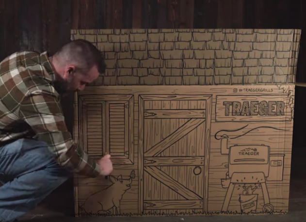
Here’s an example of surprisingly delightful packaging design from an industry that you probably never imagined: backyard barbecues.

Traeger is the original brand of pellet barbecues and smokers. They invented the category, and they’re the undisputed leader in high-end barbecues.
As you would imagine, these grills come in big boxes with a lot of parts.
Some people see the unboxing experience and Ikea-like assembly process as a pain in the ass, but the folks at Traeger recognized that and designed their package accordingly.
The first step in the instructions is to crack open a beer — the box actually provides cup holders for that exact purpose.
And when you’re all done, the box becomes a playhouse for the kids.
Not only is it unexpectedly great branding, Traeger’s new packaging is also good for the environment. They eliminated all the styrofoam from their boxes and improved their supply chain efficiency without increasing costs.
That’s where good design intersects with smart business, honest-to-goodness brand values, and authentic brand personality.

I expect great performance out of a Traeger grill, and now for the first time their packaging is designed as well as their products. It’s what we call brand alignment, and it touches all facets of a business…
You don’t want your advertising saying one thing, and your packaging saying another. Or your customer service staff. Or your HR dept. Or your social media posts.
It all matters. Your brand is the soul of your company and it should be engrained in everything you do, not just in packaging design and marketing.

Business owners are challenged by package design projects, because they think it’s all art.
But it’s not. It’s time to change your perspective on package design.
Packaging design is only 1/3 art. It’s also 1/3 brand strategy and 1/3 operations. It’s a holistic mind meld of art, science and business. Ignore any part of it at your own peril.
Most business owners just go with what looks cool, hip, colorful or trendy. Or even worse, they go with what they personally find personally appealing. They’re not able to separate their own, personal aesthetic tastes from a wise marketing decision.
But that’s kinda like asking your husband to decorate your living room — complete with carpet, drapes, furniture and art on the walls. Not much chance of it all coming together perfectly.
Packaging design is way harder, and way more important that what your living room looks like. Re-branding is much harder than re-painting.
![]()
In the 1986, after CocaCola went through their misguided “New Coke” marketing debacle, they managed to regain a bit of goodwill by going back to the old, curved coke bottle shape that they had abandoned in the U.S.
It was a nod to the history of the brand, and to better times. They knew they could always fall back on that iconic package.
That shape, all by itself, conjures up all sorts of positive brand affiliations. It connects generations of consumers to a cultural, national ethos that really meant something to them.
Is your package making any kind of connection with people? What is it saying? Does it evoke any sort of positive emotion or is it just pissing people off?
How many times have you been frustrated by packaging over-kill and those annoying, plastic clamshells that no one can open without the use of vice grips and a Sawsall? All from companies that claim to be environmentally aware.
Nowhere is package design more important than in the aisle of the grocery store.
Modern American grocery stores offer a mind-numbing plethora of choices in any category. I can’t just run into the store and pick up a six pack of beer. I have to stand there and ponder…
Do I want a light ale, dark ale, red ale, IPA, pilsner or stout? Local micro-brew, import or regional brewery? Do I want something light that my wife will also like? If so, that narrows the choices to only 20 or so. Hazy IPA or clear IPA? How many IPAs do we really need?
Am I really worthy of this Arrogant Bastard Ale? It says on the package that I’m not. I don’t know. I’m so confused! Oh dear God, how long can I stand here before I start looking like a completely clueless beer idiot?
Screw it… I’m just going to grab what I always get.
That’s what shoppers go through every day, in every aisle of the grocery store. Thankfully, great packaging can clear up a lot of that confusion and help paralyzed beer buyers or tooth paste pickers make a relatively safe, informed purchasing decision.

The first job of the package design is to catch the shopper’s eye and get her to pick up your package.
If she touches yours, instead of the competitor that’s sitting right next door, you’ve won half the battle. Then she needs a reason to turn it over and read more. In the process, she’ll make the decision to buy or not to buy.
It’s not a rational decision, it’s an emotional one.
That’s why design can have such a tremendous influence… aesthetics alone can turn the tables.
There are many other, completely unrelated reasons why she might choose you. In “Why We Buy” Martin Lindstrom points out that unconscious personal rituals, family routines and even superstitions can have a huge influence.
It could be status or belonging that she’s longing for. Or simply risk avoidance, like my choice in beer.
Or maybe it’s just familiarity that triggers an impulse purchase… The stronger the brand, the better she feels and the more likely she is to buy.
If it’s aligned properly, your packaging design is the tactile incarnation of the brand’s mythic storytelling.
It brings the subconscious to the surface and connects the dots for people who may have been exposed to the brand through social media, advertising or public relations.
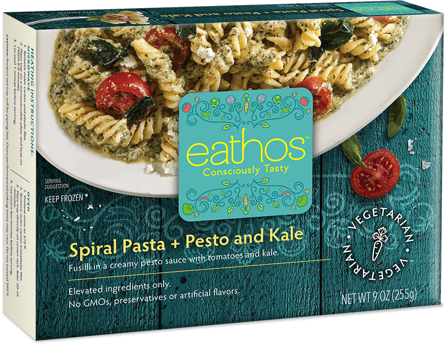
Like this package my firm recently did for a new frozen food brand, Eathos.
The name we came up with, the tagline, the package design and the brand narrative are all aligned because we did the strategy work up front. We laid the foundation of the brand story long before we started designing anything.
George Lois, the great advertising art director famously said that design projects should always start with the words. That word, or phrase, is the big idea in a nutshell, and that’s the basis for the brilliant communications that help establish iconic brands.
A good example is the story of Tazo Tea. When Steven Lee and his partners launched that brand it was story first, all the way. The myth, and the packaging that went with it, enabled them to stake out a leadership position almost from the get-go. The words led the way.
Facts tell. Stories sell. And the fact is, your packaging deserves a lot more attention than you’re probably giving it.
As Peters says, “Even the most mundane, humdrum product can be revolutionized by a mindful approach to design and packaging. ”
So give us a call and let’s start a dialog about the story behind your brand. Then, and only then, we’ll talk packaging. Contact me here, or reach out on LinkedIn. See more examples of our package design.


Appreciating your content to enrich our digital lives is always nice and it has greatly helped me.