Let’s face it… Rebranding can be a costly pain in the ass. It’s probably the last thing that most CEOs would choose to tackle. (Too artsy. Too nebulous.)
If you have a start-up company it’s better to avoid rebranding by being extra thorough with your initial brand strategy, naming and identity design. But sometimes it just has to be done.
When it’s done well rebranding pays off in the form of short-term media buzz, a pleasant, unexplainable uptick in customer satisfaction and long-term brand loyalty.
But it can also be an epic fail that leads right back to where you started. (Ask Gap about that)
Most of the time “Rebranding” is nothing more than a re-fresh of the brand identity. But smart companies take it further. If you’re going to go down that road, better go big!

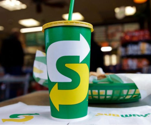
For instance, Subway’s “Eat fresh refresh” rebranding initiative includes the biggest change to their menu in the last 15 years.
They redesiged all their packaging, redecorated 24,000 locations, reprinted graphics, re-built apps, reprogrammed the website, and executing a new advertising campaign featuring some A-list stars.
If you’re going to do a major rebrand like that, there better be solid strategic reasoning behind it.
For subway it was a steady decline in sales. Their market share among sandwich shops dropped from 41% in 2013 to 28% in 2020, according to Restaurant Business Magazine. The chain closed 1000 locations during the pandemic. They needed to do something dramatic.
Subway CEO John Chidsey told CNN Business that they “want to make a loud enough bang to lure some of our customers back.”
That means you have to look at the big picture, not just at the logo refresh.
Chidsey is bullish on the changes they implemented… In the year since the launch of the new menu and the new brand identity, the company is reporting a volume increase of at least 7.5% in most of their locations — far better performance than the previous 5 years.
Here are some things to watch out for if you’re considering a rebranding initiative of any kind:
1. Throwing out a good brand name in exchange for something horribly generic.

There’s a resort in my home town that just announced a move that will surely go down as one of the worst rebrands in the history of golf. They’re abandoning Pronghorn, and going with a generic name: Juniper Reserve. What a snoozer!
It’s a horrible name for a hundred reasons. Here’s just a few:
- There’s a very good municipal golf course just five miles away named Juniper, so it’s going to cause immediate, unnecessary confusion in the marketplace, and quite possibly, legal issues.
- And speaking of confusion how’s the typical golfing tourist supposed to decipher this mess? Instead of one clear brand message, there are now three that are completely convoluted.

It’s bad news for anyone who purchased a home or a lot in “Pronghorn.” Their property values just took a painful nosedive, thanks to a misguided decision to abandon Pronghorn’s positioning as an upscale golf community. And for what???
According to Pronghorn’s press release the managers want to start marketing wellness packages and weekend meditation retreats.
So what?
That’s just a simple marketing tactic, not a reason to give up a name that has great brand equity. I suspect there’s going to be tremendous blow-back, if not litigation, on that rebranding decision.
2. Misunderstanding the definition of branding and rebranding
Before you run out and hire a design firm to “redo the logo,” spend some time refreshing your fundamental understanding of branding. It’s a lot deeper than just design.
I don’t think we should even call it “rebranding.” I hate that term. Like so much of the marketing industry jargon, the term itself misleads and adds confusion, not clarity.
The term implies that Rebranding is a project that can be launched and completed in a few short months. Like any old graphic design assignment.
But it’s more than that. At some point, without anyone really knowing it, the rebranding effort will morph back into an on-going branding effort.
The line gets blurred. So you better understand branding.
Think of it as another chapter in your long-term branding effort. It’s a chapter that represents significant change, but it’s just part of that long-term branding continuum. It’s a never-ending process, not a project.
3. Holding on too tightly to the past
Some clients get very emotionally attached to their logo, their colors, their brand name and even the font choice and the interior design of their stores. They want to hold on to — or re-live — that feeling they used to get from their brand identity.
Doesn’t matter if it was a horrible color to begin with. It’s what they’re used to. Nostalgia is a powerful motivator.
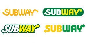
Here’s the progression of the Subway logo over the years: Notice how they have now reverted back to an orange color that’s closer to their original logo colors. They claim it’s “getting back to their roots in the early 70’s.”

Many small companies get married to a brand identity that has absolutely no recognition in the marketplace. They’ve put no marketing muscle behind it, so there’s really no risk of losing anything. And yet they get all bent out of shape when a change is suggested.
Especially when it’s a spouse who designed the logo in the first place.
Don’t abandon completely an identity that’s well recognized.
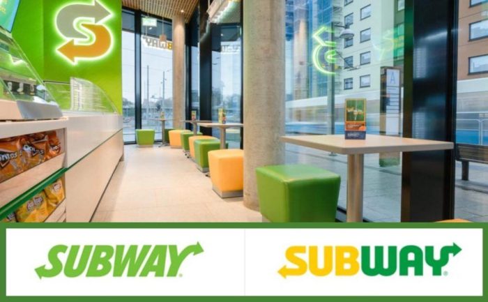
The color selection, the font, and the arrows all work together to make the new Subway ID clearly Subway’s. They’ve now added a mark that’s used separately from the logo type, and it too has a clear connection to the sandwich chain.
And don’t cling to an identity that’s invisible.
Anything’s better than invisibility.
4. Misguided motivation for the re-brand
Pronghorn did not have any good reason to change the brand name.
Subway, on the other hand, had good, strategic reasons to update their brand identity.

The company, which was started in Connecticut in 1965, basically invented the category of healthy fast food. Plus, they were the first to allow customers to dictate exactly what goes into a sandwich, and watch as it’s being made.
But in the last 10 years there has been a surge of activity in the fast casual dining category where customization is standard procedure. Now there are dozens of chains that allow you to customize your own sandwich, pizza, salad, pita, taco or veggie burger. Rapidly growing brands like MOD Pizza, Firehouse Sandwiches, Sweetgreen and Chipotle have slowly-but-surely eaten away at Subway’s domain of healthy fast food.
That’s a seismic shift in the marketplace that no amount of design is going to alleviate.
Boredom is the absolute worst reason to dive into a rebranding effort. Boredom and ego.
But you’d be surprised how common it actually is. One design firm veteran once told me, “If it weren’t for boredom and big egos, we’d be out of business.”
A new marketing director comes in and wants to leave her mark. So her team starts adding colors, changing the narrative, or making any number of misguided modifications. Next thing you know they’re doing a complete rebranding, “for consistency purposes.”
That’s the ego part.
As far as boredom goes, I’ve run into plenty of clients who want to change things up, just because they’re bored with their current brand identity or advertising.
They often justify it by saying “our consumers are getting saturated with our brand. We need to change things up.”
That’s utter nonsense! The only people who are saturated with the brand are the people inside the marketing department who are working with it, day in and day out. Hate to say it, but nobody else is paying that much attention!
It’s like looking at the same decor in your living room day after day. You might get sick of it — and feel a burning desire to paint some walls and rearrange the furniture — but none of your guests will feel that way. They don’t see it. It’s not relevant in their daily lives.
I’ve never seen, nor heard of, a case where a company is so over exposed they needed to give consumers a break and go dark for awhile. That would really be something.
4. A half-hearted commitment to the rebranding process
This is a biggie. There has to be full-fledged commitment from the CEO, the board of directors or business owner. It has to be a high level, top-down decision, not something that’s being pushed from the design department.
The big wigs have to be all in.
Not only that, the decision makers need to be fully committed to the vendor who’s going to execute the rebranding plan. No second-guessing! So they need to have a high degree of trust in that vendor before they ever embark on a project that important.
So test the waters. Always hire the firm for a few smaller projects before you dive into a rebranding effort with them.
From their perspective, the branding firm needs to have an intimate understanding of your business. Otherwise, they will not succeed. That’s not something you can accomplish in a couple of Zoom meetings and a collective brainstorming session. The Creative Director or the brand strategist has to be embedded with your company for awhile.
Plus, you need insight from outside the company. You can’t rely on one inside source for a fair assessment of what’s really needed. You need to do some strategic listening, and hear it from the customers.
5. Too much drawing. Not enough thinking.
I’ve seen clients obsess over ridiculous little details for months. Micro managing things like the thickness of a particular serif or the color shade of the tagline type will have no affect on outcome of the branding process, except for alienating everyone involved.
That’s usually a sure sign that they’ve not done their homework, and they’re insecure.
If it’s your company that’s being rebranded, stick to the big picture stuff that goes on before anyone picks up a pencil or touches a mouse.
That means strategy. And for that, you absolutely must be intimately involved.
Never delegate brand strategy completely to an outside agency. As CEO or owner it’s your job to dig deep into the nuances of strategy. Make it your own, personal quest to make sure the strategy, the messaging and the words are absolutely right before the design team starts
Otherwise, they’ll just be spinning their wheels on misguided ideas that cost a lot of money.
If you need help with a rebranding project, contact me at BN Branding. Or browse around our site and then fill out a contact form. Or connect with me on LinkedIn.


