![]()
I seldom use the Brand Insight Blog to critique individual ads. It’s just too easy to nit pic the details like an idiotic headline, the lazy use of stock photography, or another banal block of Ai generated copy.
But some years ago I saw an ad in Golf Digest that continues to set the bar for what NOT to do when advertising a golf destination.
So let’s go across the pond, for a minute, and talk about the golf destination that’s a distant fourth behind Scotland, England and Ireland.
For Americans, a trip to Wales is a tough sell. Let’s face it… the Holy Land of golf is right next door and Ireland is just a ferry ride away. Despite its coastal beauty and some exceptional links courses, Wales isn’t even on our radar.

Here’s another important fact the Welch tourism office didn’t consider: Golfers have a phobic aversion to big numbers.
We hate 6s and 7s!
An 8 on the scorecard – a dreaded snowman – is worse than contracting an STD. Nines and 10’s aren’t even spoken of, much less, featured prominently in the headline of an ad.
Which brings us to the print ad in question…
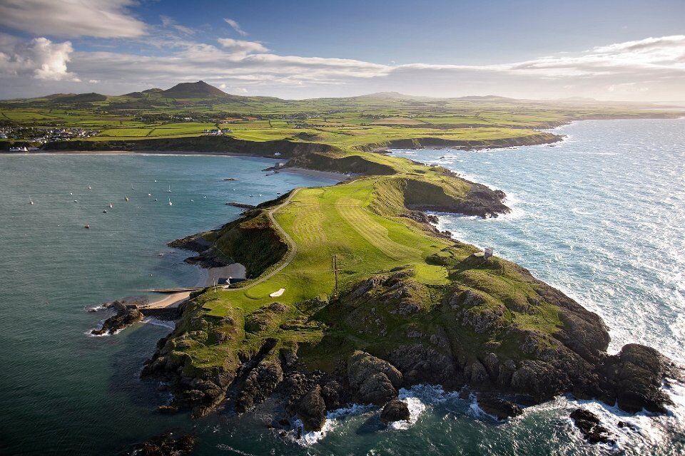
It was a full page in Golf Digest, retail value at that time; $78,000. It included a mediocre aerial photo of a costal golf course on a dramatic spit of land, with a big headline that went like this:
“6,7,5,6,7,7,9,7,5,6,6,7,8,6,7,8,5, but happy.”
Huh????
That’s the most blatantly unappealing headline I’ve ever seen in golf industry advertising. (And that’s saying something!)
There’s no way a traveling golfer is going to be happy with a scorecard like that. Not in a million years. And the cliché-ridden body copy does little to relive my discomfort with the whole idea:
“We all get those days. Where you seriously consider packing it all in and taking up darts or something. But even a bad round here has its positives. Stunning championship courses. Reasonable green fees. No pretentious nonsense. A good walk through our beautiful countryside. And best of all, in Wales tomorrow’s always another day.”
Tomorrow’s also a fine day to fire your copywriter.
Apparently, the message is: Travel all the way to Wales and magically, somehow, you’ll feel good about all those 7s and 8s and 9s on the scorecard.
Talk about a disconnect!
7s 8s and 9s are even more depressing at a seaside course in Wales than they are back home. It’s every golfer’s worst nightmare… travel 3,000 miles to an epic destination and then stink up the place.
Been there, done that. (Okay not that bad, but bad enough to leave a scar.)
So here you have advertising for a golf destination that doesn’t just lie limp on the page, it screams bad experience! It actively turns people off.
For me, it conjures up memories that are emotionally scarring and now I will forever associate Wales with horrible golf.
Ouch.
You will never convince golfers that terrible scores will be more palatable in Wales, or Hawaii, or Cabo, or wherever. That should never be part of your strategy for advertising a golf destination. It’s an unbelievable, irrelevant message that misses the target audience by a mile.
But let’s be fair. The Wales Tourism Board isn’t the only organization that misses the mark when it comes to strategic message development for golf destination ads.

Every industry has its advertising conventions — required elements, if you will. In the pizza industry it’s the “pull” shot; a close-up of the cheese pulling off a slice of pizza. In golf resort advertising it’s the pretty picture. And more specifically, the pretty drone shot.
Just show the beauty shot of the course with sunlight streaming across the fairway. Fly back and forth over a few holes and throw in a couple lines of cheesy narration about the “championship course suitable for all golfers.”
So it’s not surprising that all golf destination ads look alike. Same idea, just insert a different location.
There’s no story telling. No relevant message that’ll connect with anyone on an emotional level. And there’s very little differentiation. Most courses don’t even take time to vet their photos very well or shoot video with people on the golf course.
Same goes for travel industry advertising in general. It’s almost always just a pretty picture and a few throw-away words.
So here are a few universal tips for anyone who’s doing advertising for golf destinations:
• Assess each possible message on a credibility scale. Turn the BS meter to full volume and honestly decide which statements are believable and which ones sound like marketing hype. Being happy with snowmen on the scorecard definitely falls into the unbelievable marketing hype category.
• Identify the hottest pain point for your best customers, and work from there. Big numbers are definitely a pain point for golfers. Unfortunately, Wales can’t promise to solve that problem. This goes to messaging strategy… Wales has a lot of competition in the golf travel category. Their golf courses are not as great as Scotland’s, so they have to come up with a different angle of attack. A different strategy altogether.
• Identify the messages that are in line with your core brand concept and move those to the top of the list. Don’t deviate. Oh, if you don’t have any core brand concepts nailed down, we can help you with that.
• Get some professional help. You’re too close to it to make sound judgment on what will resonate, and what won’t. Time after time, our market research proves this point. Golf travel advertising has the potential to be truly great. Don’t waste that opportunity by running mediocre ads.
• Know your market and the subject matter. Do the research. It’s pretty obvious that whoever did the ad for Wales had no experience with, or knowledge of, golf destination advertising.
• Beware of plagiarism. If your message sounds a lot like your competitor’s message, throw it out. In that Golf Digest Ad, Wales uses the tagline “Golf as it should be.” A blatant rip-off of the Bandon Dunes tagline: “Golf as it was meant to be.”
On a side-note… When I was working on Bandon Dunes advertising I coined the phrase “Unconditional Love.” The visual was just the opposite of the usual pretty picture… a lone player, braced against the elements, carrying his bag up a dune to a flagstick bent by the wind, rain in his face, ocean waves heaving in the background.
It was a great ad that didn’t run for long because it didn’t include the conventional pretty picture.
To this day, Bandon Dunes will not publish anything that involves the true weather conditions there. Every single social media post is a pretty picture that’s, quite frankly, not authentic to the Oregon Coast experience.

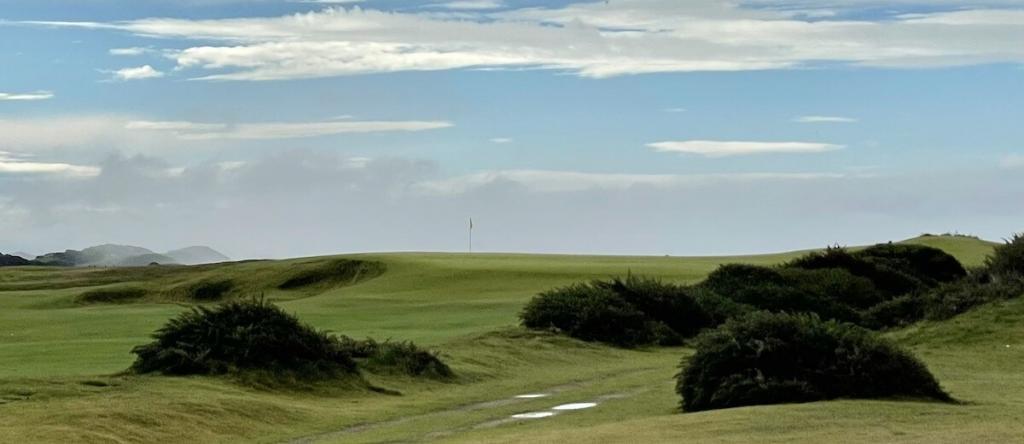
The chances of getting a perfectly calm day at Bandon Dunes, like in my photo of the Sheep Ranch, are very rare.
Instead, Bandon should embrace the elements and include some photos that are not fair weather shots. That’s part of what makes links golf so challenging and different… you’re not only pitted against the course, you’re battling the elements as well. For me, and for thousands of other Bandonistas, windy days and a little bit of rain is part of the appeal.
Would you like to learn more about how to develop a message that will really resonate with your target audience? Read this post.
Here are some better examples of golf destination advertising.


Great post.
The focus should have been on the Ryder Cup in 2010 and the destination golf resort: Celtic Manor, because ‘Wales’ and ‘Golf’ are an oxymoron.
Sadly, Wales is still suffering from an inferiority complex of playing second-fiddle to England. It’s always ‘England and Wales’ never ‘Wales and England’. Witness Wales’s ‘Big Country’ campaign a few years back which for a ‘tiny country’ got squashed in the destination branding marketplace.
Alan ‘Brand’ Williamson
Destination Brand Developer
Absolutely agree. Wales has some fine courses so I feel bad being critical too but you have just about nailed it. They need professional help badly. Wales is very under rated but combined with poor marketing the golf product is a none starter.Hey but maybe their rounds are up, that is partly the test. Scotland is the home of golf, Ireland has the craic but Wales has potential to be in the mix if they market themselves properly at least.