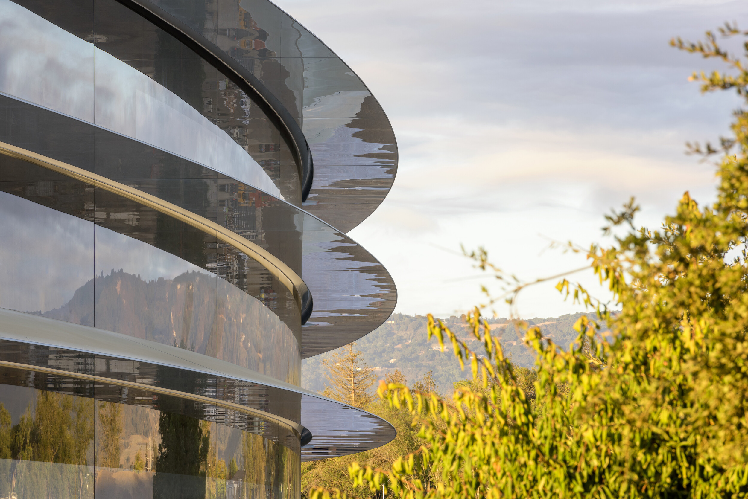
![]() It was said to be Steve Jobs’ last great obsession… Apple Park.
It was said to be Steve Jobs’ last great obsession… Apple Park.
The corporate headquarters looks like a spaceship from a 1950’s sci-fi story. 12,000 employees in one building. 2.8 million square feet of space. The world’s largest panels of curved glass. 9,000 draught-tolerant trees. Five billion dollar price tag.
The ultimate expression of the Apple brand under Jobs. And big-league brand alignment.

When it first opened Steven Levy wrote a fascinating feature about Apple’s new headquarters for Wired magazine. For that piece, he interviewed Apple’s Chief Design Officer, Sir Jonathan Ive, who recently left Apple to start his own firm.
Ive oversaw the design of every Apple product from 1997 to 2019. Since Design is the heart and soul of the Apple brand, one could argue that Ive is the heart of Apple.
“It’s frustrating to talk about this building in terms of absurd, large numbers,” Ive said. “While it is a technical marvel to make glass at this scale, that’s not the achievement. The achievement is to make a building where so many people can connect and collaborate and walk and talk.” The value, he argues, is not what went into the building. It’s what will come out.”
More fantastic designs. More signature products from the world’s most valuable brand.
Brand alignment involves a lot of things…
It’s how you communicate the Brand to your employees. It’s the events you sponsor and the companies you’re affiliated with. It’s the consistency of your messaging and graphics. It’s product design and yes, it’s even the design of your new office.
In Apple’s alternative universe, the giant circular ring of glass is perfectly aligned with the brand.
All Fortune 500 companies spend enormous sums on corporate headquarters because they understand that it really does matter to their most important brand ambassadors… employees.
Your office space says something about your brand and your culture. No matter how big or small your company is.

Small professional service firms should also make sure their space aligns with their brand.
When you’re selling a service, and have no tangible product, your workspace is an important physical manifestation of the brand.
(Or at least is used to be, before COVID 19)
In fact, depending on the business you’re in, your office space might be the single most important example of brand alignment.
For instance, when it comes to selecting an ad agency, office space always figures into the equation. The workspace is a tangible display of the agency’s creativity and “out-of-the-box” thinking. (Or lack thereof.)
Clients love doing business with the cool kids in the cool offices.
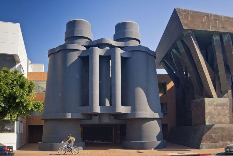
They want to go somewhere that feels different, more energized or more “free” than their own place of business. It’s an escape from their normal, day-to-day reality. Clients feed off that. (Take a tour of Weiden & Kennedy’s Portland headquarters and you’ll see what I mean.)
If you’re an architect or an interior design firm it’s even more important… Your office space is an everyday opportunity to show off your work. It’s “Exhibit A” in the firm’s portfolio. It better be impressive.
For attorneys it’s about showing off their ivy league law degrees and proving, somehow, that they’re worth $450 an hour.
Cue the leather sofa and the $20,000 desk.
Harry Beckwith, in “What Clients Love,” tells how State Farm Insurance chose a firm to handle a huge payroll and benefits contract. They looked at all the proposals, narrowed the field, sat through presentations and listened to pitches from several very capable companies. They were all pretty comparable in price and service.
Then they dropped in, unexpectedly.
The State Farm guys walked through the offices of each competing firm, said a quick hello to their contacts, and chose the office that “felt the best” based on that one visit.
It’s a completely irrational, emotional, gut-instinct thing. (Have you ever walked into a restaurant and just felt an instant, knee-jerkingly negative vibe?)
First impressions matter. Details matter… Location. Colors. Layout. Even the coffee you serve says something about your brand. Is your company percolating along on Folger’s, or is it serving up a hot shot of espresso with a perfect crema on top?
Ask yourself this: Is there a disconnect between what people see in your marketing materials and what they experience in your office? Be honest.
Is your office space in alignment with your brand and your corporate culture? Many small companies that are genuinely warm and inviting in person maintain offices that are far too chilly and corporate. They’re trying so hard to look big and important they overstep their own brand personality.
And vice-versa.
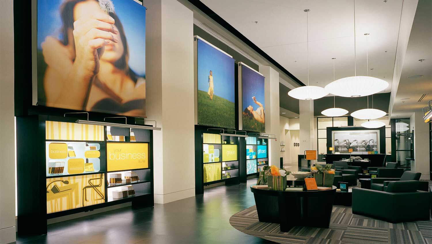
Big banks work hard to make themselves sound friendly and personable in their advertising. Then you walk into any branch, and the decor is vintage 1990s institutional snooze fest. And unfortunately, the customer experience is usually aligned with the decor. (One notable exception is Umpqua Bank.)

Ideally, you want to align the look, feel and functionality of your office space with the brand personality, culture and operation of your company.
Easier said than done.
You can’t just take the “about us” section of your website and hand that off to an interior designer and expect a miracle.
If you’re moving into a new space, or thinking of a refresh of your current office, it helps to go back to an honest assessment of your brand… To your core values and your main messages that always seem to get relegated to internal documents and forgettable, corporate mission statements.
Your brand needs a bible.
That way, you always have a clear reference point. A testament. A philosophical road map that can be the inspiration for your marketing efforts, your business initiatives and your latest office makeover.
So when you’re looking at colors and carpet and furniture you can hold up the bible and say, “is this on brand? Is this really us?” Is this the right direction?
When I’m working with a new client I always start with that fundamental. I work with companies to spell out their brand and put it down on paper.
It’s not easy.
It requires research, a lot of listening on my part, and a lot of soul searching from the client. (More than most people ever have time for.)
But it saves tons of time later on by eliminating false starts when we’re working on tactical marketing items like digital advertising, a trade show booth, a powerpoint deck, or a new corporate video.
Or new interiors, for that matter.
“The right input is crucial for corporate jobs,” says Lisa Slayman of Slayman Design. “When clients are wishy-washy about their brand… that’s when things get difficult.”
The same goes for marketing.
“The best clients are the ones who are clear about what their company stands for. What their brand is. When I see it down on paper, that makes it a lot easier to translate to the interior design job. It makes every decision easier.”
Getting the brand message right and communicating it quickly and clearly is one of the most important things you can do as a business owner. You can’t have brand alignment if you don’t have your brand defined.
Your brand bible should inform hiring decisions, marketing decisions, operational decisions and even finance decisions. It should unite people and provide the crystal clear marching orders you need to move continually in the right direction.
If you don’t have one, call me.
When you approach new office space from a strategic, brand perspective the interior design becomes another opportunity to reinforce a specific set of values and beliefs.
You can integrate your brand aesthetic into the everyday lives of your people and your visitors. So if some prospective client just happens to pop in, you’ll leave the right impression.
The brand impression.
Here’s what Apple CEO Tim Cook said about the new Apple Park… “Could we have cut a corner here or there? Sure. It wouldn’t have been Apple. And it wouldn’t have sent the message to everybody working here every day that detail matters, that care matters.”
For more on why brand alignment matters, try THIS post.


This is SO true! I contracted for 2 months for the lamest PR company and they had an old smelly building overflowing with dirty dishes in plain view of the front door.The killer was he decorated the “board room” with pages ripped from magazines and a giant suit of armor from the local garden store…oh, and dead plants..
Lol..
Lisa Wynn
John, great article….I was thrilled to come across it but also disappointed at the same time as I was working on a post for my blog that was similar subject matter.
I would like to ask your permission to re-post the article to my blog with you as the author and the appropriate mention for you and your firm.
Let me know your thoughts
Hurrah, that’s what I was exploring for, what a data! existing here at this web site, thanks admin of this web site.
Couldn’t agree more visited Google Kenya office and Coca cola offices in Nairobi and I felt the size of the brand.