![]() It’s been quite a ride… watching the progression of strategic website design over the last 30 years.
It’s been quite a ride… watching the progression of strategic website design over the last 30 years.
Trends have come and gone, technology has improved, entirely new platforms have been developed and the graphic style continues to evolve.
These days it’s much easier to do it yourself, and that DIY trend seems to be producing a lot of cookie-cutter, template-driven websites that are not the least bit distinctive.
For example, I was recently talking with a startup that has a war chest of 2.4 million dollars, and their website reads like an encyclopedia entry.
It’s nothing but boring facts, hyped up sales data, and lots and lots of information. It’s not even well organized facts.
There’s not an infographic to be found. Not a single story told. Not a hint of brand personality. And they wonder why they’re having trouble “getting traction in certain verticals.”
Their site was barely functional for interested early adopters, much less loosely interested parties at the top of the sales funnel.

The fact is, websites needs to be work on many different levels.
In this age of mobile computing your site needs to function as an on-line calling card, a customer service tool, a lead generation tool, an educational tool and, for many companies, a storefront.
So let’s look at the 5 most critical levels of website performance…
Strategic website design level 1 — Make it work like a good, old-fashioned, phonebook ad.
Back in caveman days (before the internet) there was only one way to find businesses: the YellowPages.
If you were in business, you HAD to be in the phone book. So you could opt for an inexpensive line listing in your respective category, or you could buy an ad.
Kinda like Google these days. Your “Google My Business” listing is the modern equivalent of the yellow pages line listing. You can’t afford to ignore it. And you’re better off if you buy the ad.
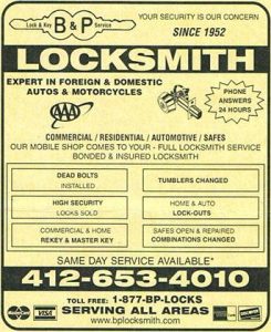
Here’s an example:
I recently broke a key off in my Thule ski box on top of my car. I called the first locksmith that popped up. The company that bought the Google ad got my business. (Just like the guy who had the first ad in a category in the yellow pages.)
Next in line are the three companies that have listings on Google My Business and show up on the map. Those four locksmiths get 90% of the emergency calls in my market.
So make sure your local listing on Google is up to date. Also, make sure that the homepage of your website also has that basic, directory information, plain to see.

But here’s a completely different buying scenario: Let’s say you need new locks on the doors of your office building. There’s valuable equipment in there, so once again you find yourself searching for a locksmith.
But this time you have a dramatically different set of needs and expectations.
Same exact unique visitor, vastly different context. Different search criteria. Different emotion. Different behavior.
In that case, the locksmith’s website needs to work on a different, deeper level. What served the purpose for emergency work doesn’t cut it for a more thoughtful purchase. It requires more than just a basic, informational listing.
It’s about credibility and differentiation.
2. Website design for the first impression level.
The most basic rule of marketing is to make a good impression. Quickly!
If you don’t, your prospects will never make it to conversion.
Doesn’t matter if it’s a business card, a Powerpoint presentation, or any other tactical marketing tool… the first step to success is making a good impression.
So how do you do that on a website?
Famous Chicago MadMan, Leo Burnett, once said, “Make is simple. Make it memorable. Make it inviting to look at. Make it fun to read.”
There you go. The old-school thinking that was used to design yellow pages ads is perfectly relevant for websites today.
Unfortunately, that’s a tall order for web developers who are accustomed to writing code, not copy.
And it’s impossible for business owners who are muddling through a do-it-yourself website… “Choose a color. Insert logo. Put content in these three boxes. Add a stock photo. Proceed to check out!”
The fact is, most small-business websites fail miserably on this basic, 30-second marketing level…
They’re not memorable. They’re not fun to read. And there are no differentiating features… they look just like a million other websites built on the exact same design template for the same type of business.
That’s why the bounce rate from home pages is so ridiculously high. They don’t make a good first impression. In fact, most make no impression at all.
3. Strategic website design for the conceptual, branding level.
Pliny The Elder once said, “Human nature craves novelty.”
More recently, marketing guru Seth Godin said, “In a crowded marketplace, fitting in is failing. Not standing out is the same as being invisible.” The whole premise of his book, Purple Cow, is “if you’re not Distinct, you’ll be Extinct.”
Being distinct is what branding is all about.
Unfortunately, most business owners have no idea what “distinctive” looks like in a website. And web programmers have a hard time disrupting the conventions of their tech-driven business, so you can’t rely on them for a distinctive looking website.
The conceptual level of your website revolves around your core brand concept — that one, engaging idea that goes beyond your product and price, and touches on a deeper meaning for your business.

For example, BMW’s core brand concept is stated very clearly: “The Ultimate Driving Machine.” It’s about engineering, handling and speed. It’s not a brand for soccer moms. The first glance at the BMW website makes that clear.
When communicated consistently, a core brand concept will provide three things: Relevance. Differentiation. And credibility. Every great brand maintains those three keys over time.
Often it’s not an overt statement, it’s a collection of symbolic cues and signals that come together to provide the ultimate take-away for the web user.
It’s the use of iconic, eye-catching images rather than stock photography.
It’s a headline that stops people in their tracks and questions your competitors.
It’s navigation design that’s both intuitive to use, AND distinctly different.
It’s clear, compelling messages each step of the way.
And most importantly, it’s craftsmanship! In the art, the words, and the programming.
When your site is well crafted your conversion rates will dramatically increase. Guaranteed. So rather than just jumping into a quick, do-it-yourself site, stop and think about your brand.
Do you even know what your brand stands for? What your promise is? Can you communicate your idea in one sentence? Do you really know your market, your customers, your value proposition?
Those are the fundamentals.
That’s the homework you need to do before you even start thinking about programming. Because no amount of technological wizardry can compensate for the lack of a clear, single-minded brand idea.
4. Website design for the research or “how-to” level.

The deepest level of engagement in a website is content that educates, informs and enlightens.
People are hungry for information and quick to examine the details of even the smallest purchases, so give them the meat they need to make an informed decision.
Don’t make them go to your competitor’s website for honest insight on the purchase decision they face.
On business-to-business websites this often takes the form of webinars, videos, white papers, videos, articles, blogs and tutorials.
On retail sites it’s third party reviews, product comparisons, user-generated content and the story behind the story of your products or organization. This is where your site can get very deep and very relevant for serious prospects.
Don’t overlook this deeper level of informative web design.
Don’t assume that everyone’s just going to buy right from the product page that they first land on. Many will snoop around and learn more before they click on the “buy” button.
5. The conversion level.
Of course, the ultimate goal of most websites sites these days is to sell stuff. Which means the definition of a “conversion” isn’t just gathering an email address, it’s sidestepping the middleman and moving product.
In that case, the site isn’t just a marketing tool, it’s an integral part of your entire operation.
Therefore, it needs to be integrated with your inventory management system, your POS system and your accounting software. It needs to be a living, breathing operational feature of your selling strategy.
Not only do you have to persuade, motivate and move people to action, you also have to provide a user-friendly shopping experience.
Otherwise, people will just jump over to Amazon and buy your product from some crummy, third-party reseller.
So you need website design that’s both “On Brand” and easy to use. We can help you with that.
If you want to improve the performance of your website, and transform your ordinary business into a powerful brand, contact me here.
More on the importance of branding or on Website design and development


Our site was designed around a perception of good honest and quality contracting along with products that are of top shelf quality. However having launch the site on Dec 26, 2011 and reviewing growth of visitors and other pertinant analytics. It appears that we are getting visitors but no conversions i.e. forms sent. I am very interested in learning more about how branding sites encourage people to fill out forms and inquire or request more info.
it’s OWESOME article Thanks for sharing it!