They rely entirely on their website design and their social media presence for revenues.
For those companies, better homepage design isn’t just nice to have, it’s essential to their continuing existence. It’s not just a marketing differentiator, it’s a critical piece of their operation.
The homepage is the modern-day business card, sales pitch, storefront window display and company brochure all wrapped up in one. For the vast majority of companies, it’s the center of the marketing universe.
I’ve seen many trends in website design come and go over the years. Thankfully, it’s been getting better, but many companies still seem to think of their homepage like a developer thinks of bare land…
They believe every square inch is “valuable real estate.” Not to be wasted.
So they cram as much as they possibly can into that screen. To them, white space is just as useless as a vacant lot.
I’d like to offer a more constructive analogy:
For better homepage design, think of it as the cover of a magazine.
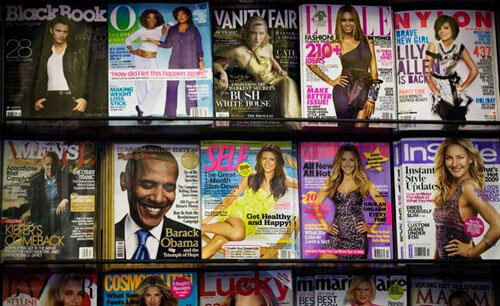
How many of you remember the days of the newsstand, with all those glossy magazines competing for your attention?
When it came to cover design, they all had the same objective… stop people from browsing, trigger their curiosity, and get ’em to pick it up.
The cover alone needed to entice people to skip over all the competitors in the same category and take a look. In a nutshell, the magazine cover had to sell magazines.
The same can be said for your website homepage.
The homepage has to trigger curiosity and convince people to stick around. At least for a few seconds. It needs be pleasing to the eye and tease people as to what’s inside.
So let’s look at the techniques that magazine editors use to move product off the newsstand shelves. How do they get people to pick up their title and browse through it? Because the browse always preceeds the sale.
That kind of thinking is directly applicable to good homepage design.
Choose one delicious visual for your homepage.
Photo editors spend weeks taking and re-touching just the right photo for their next magazine cover.
They look for one image that tells a story and conveys genuine human emotion. They sweat the details because they know that good eye candy on the cover pays off at the newsstand.
Webmasters use whatever they can find on Google images.
Or they take the Ebay approach and snap a quick photo of your product with a cell phone. Or if you’re lucky, they do a quick search of their favorite (cheap) stock photography site or they conjure up something using an Ai app.
That’s a fatal error that drives people away from your site and ultimately hurts your brand image. (Read more on the use of stock photos)
They are programmers, not art directors or photo editors.
Unfortunately, most small and medium-sized companies rely on them for that critical element of their home page design. That’s not how you will be found, or remembered, online.
Narrow the strategic focus.
Magazine editors know their readers, and they choose a cover article and image that will be relevant and compelling to a large portion of their audience.
Not all, but most.
Then the art director designs the cover around that article. One idea. One main visual element, with just a couple of teasers regarding other content.
On the other hand, most homepages have all sorts of products, links, information and nav options. Instead of focusing on one thing that appeals to the bulk of their audience, they try to show it all.
Unfortunately, all that clutter causes confusion and muddies your brand message. What you need is clarity and simplicity. Stop trying to expplain everything on the home page.
You only have a few seconds to answer a prospect’s most pressing question… “will this website give me what I need?” “Does it have the content/tools/products I’m looking for?”
Trying to sort through a hodgepodge of elements and endless choices doesn’t help answer that. In fact, consumer behavior research shows that when faced with too many choices, people often just disengage. That’s why so many sites have high bounce rates.
Limit the number of choices on your home page and you’ll have better click-through rates.
Besides, people don’t judge your entire operation by the homepage, but they DO judge your website from that. So you better make a good first impression.
Tease. Tease. Tease.
The objective of the homepage isn’t to make the sale, it’s to open the door and lure them in. It should entice people to click in and poke around, just as a good cover entices people to thumb through a magazine.
The art of the tease is about leading people deeper and deeper into your site, until they find just what they’re looking for or do what you want them to do.
You want to build in a sense of discovery and drama, revealing a little more at each level. Far too many websites just lay it all out, right there on the homepage.
Here’s another way to look at it… Imagine that you have a brick & mortar store in the world’s most popular mall. Your front window display is the equivalent of your homepage. You don’t shove everything you’ve got into that little window, you choose a few really tasty items and tease them for more. Like Victoria’s Secret.
You want shoppers to stop in their tracks, admire your presentation, and then walk in the door. That’s the objective. Same with your homepage.
Get them in. Lead them to what they’re looking for. And make the sale! Just don’t try doing it all on the home page.
For more on effective website design and strategic homepage planning, try this post:
If you’d like an assessment of your current site, and your overall brand messaging, contact me here.
John,
A good post here on the essence of home page design for the web; you should come to our ‘SmartGroup!’ Home page design was a recent topic at this monthly group. Check out that post at: http://bit.ly/HngBs
We’ve touched on some SEO items from the home page design as well. Cheers! Wendy