 Every 10 years or so the top marketing execs at Pepsi throw millions of dollars into a refresh of the Pepsi brand identity. They want to make the brand relevant and appealing to young consumers.
Some changes are controversial. Some go off without a hitch. Either way, Pepsi always manages to generate hives of online buzz and plenty of press every time they release another big brand redesign.
It’s not surprising… whenever you start messing around with one of the world’s most recognized commercial icons, people are going to talk.
But it’s not like grocery carts are piling up in the beverage isle while soccer moms wax eloquent about the new design aesthetic. Nope, the armchair quarterbacking is limited to graphic design forums and beverage industry trade pubs.
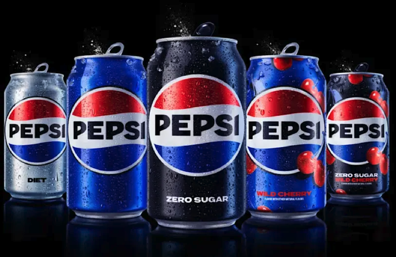
The newest edition that’s rolling out in 2024 seems to be a fairly quiet big brand redesign. (Notice that they no longer use the word “Diet.”)
The change seems to be widely accepted, probably because harkens back to classic designs of the past. It taps into the heritage of the brand and takes three steps backward in order to move forward. Here’s what it looked like back in 1973:
The last big brand redesign from Pepsi was just the opposite. Back in 2009 they created a huge stir by departing completely. Everyone had an opinion on this one:
“I love it.”
“I hate it.”
“It looks like the Obama logo.”
“It’s not young enough.”
“It’s static, empty and vaguely bland.”
“It’s demonic brainwashing.”
All the usual, judgmental responses to a big brand redesign from design industry pundits.
But then the “rationale” for the 2009 logo started circulating on the web, and the debate took on a viral life of its own.
The 27-page design brief for the Pepsi logo redesign entitled “Breathtaking” reads like a scientific white paper loaded with marketingese and unprecedented levels of highly creative BS. In fact, Fast Company Magazine called it branding lunacy…
“Every page of this document is more ridiculous than the last ending with a pseudo-scientific explanation of how Pepsi’s new branding identity will manifest it’s own gravitational pull.”
The L.A. Times was equally critical:
“Behold, then, the scattered and burning debris field of one of corporate America’s most misbegotten image makeovers… According to the brief, the new Pepsi logo lies along a trajectory of human consciousness that includes in its arc the Vastu Shastra, a 3,000-year-old Hindu architectural guide; Pythagoras (the Golden Section); the Roman architect Vitruvius; the Fibonacci series; Descartes; and Corbusier.”
Oooookay.
(Kinda reminds me of the rationale used to justify an empty blue rectangle for the Nationwide Insurance Logo. But in this case, the design itself isn’t that bad.)
The document was so over the top, some say it was a deep fake hoax. Maybe the controversy is what the design firm, Arnell, had in mind all along. Maybe someone at Arnell created the brief document AFTER the fact just to poke fun at their critics and generate media attention.
If that’s the case, the stunt has backfired, big time.
The brief makes Arnell look like corporate bandits, it makes Pepsi look bad for buying into the rationale, and it discredits the entire branding industry.
It’s hard enough to get C-level executives to take branding seriously, without this kind of nonsense floating around.
Great design speaks for itself. You don’t need a physics thesis to explain it. It just works.
My 11 year-old daughter liked that version of the Pepsi logo. (Said it makes her happy.) And now that I’ve read the exhaustive brief, I know why…
It’s a smiley face.
An overanalyzed, underwhelming, million dollar smiley face. It even comes in a variety of grin sizes. (Apparently regular ol’ Pepsi gets a smaller grin than the newer versions of Pepsi, like Pepsi Max. Whatever that is.)
Pepsi’s going to spend more than a billion dollars redoing all their packaging, vending machines, trucks, POP materials and everything else. The new logo’s going to be EVERYWHERE!
So I’m kinda glad Arnell changed the old wavy logo into a smiley face. Temporarily. But I have to admit to being a sucker for nostalgia, so in my book the latest rendition wins the prize.
Learn more about corporate rebranding and logo design, try this post.
Need a brand identity for a startup or even a side-hustle business? Need to refresh your brand identity? Contact me here, or reach out on LinkedIn.
The new logo is as dangerously generic as a poorly crafted “message” (next post).
In contrast, the logo behind Pepsi Throwback is a much better direction for the brand. It’s too subdued (blue on blue on blue) but with a little work, it could have actually been a coup for Pepsi from a retail visibility perspective AND to help make Pepsi drinking cool again.
Instead, we got this. *sigh*